In the world of mixed media art, where texture, layers, and materials interplay to tell a story, color becomes more than just a visual choice; it’s the emotional foundation of your piece. Whether you are creating mixed media backgrounds for collage, designing layered spreads in your art journal, or combining acrylics, inks, papers, and textured mediums, harmonious color choices can make all the difference. Using the right color combinations not only creates balance and cohesion but also draws the viewer deeper into your creative world.
What Is Color Harmony?
Color harmony is the visually satisfying arrangement of colors. It’s what makes a piece feel complete rather than chaotic. Whether you are intuitively choosing colors or working from a palette, harmony brings unity to your work; making the viewer feel something powerful rather than confused.
When used well in mixed media, color harmony helps:
- Balance the complexity of materials
- Guide the viewer’s eye
- Evoke specific moods or energies (like calm, passion, or mystery)
- Connect different artistic elements into one cohesive vision
Why It Matters in Mixed Media Backgrounds
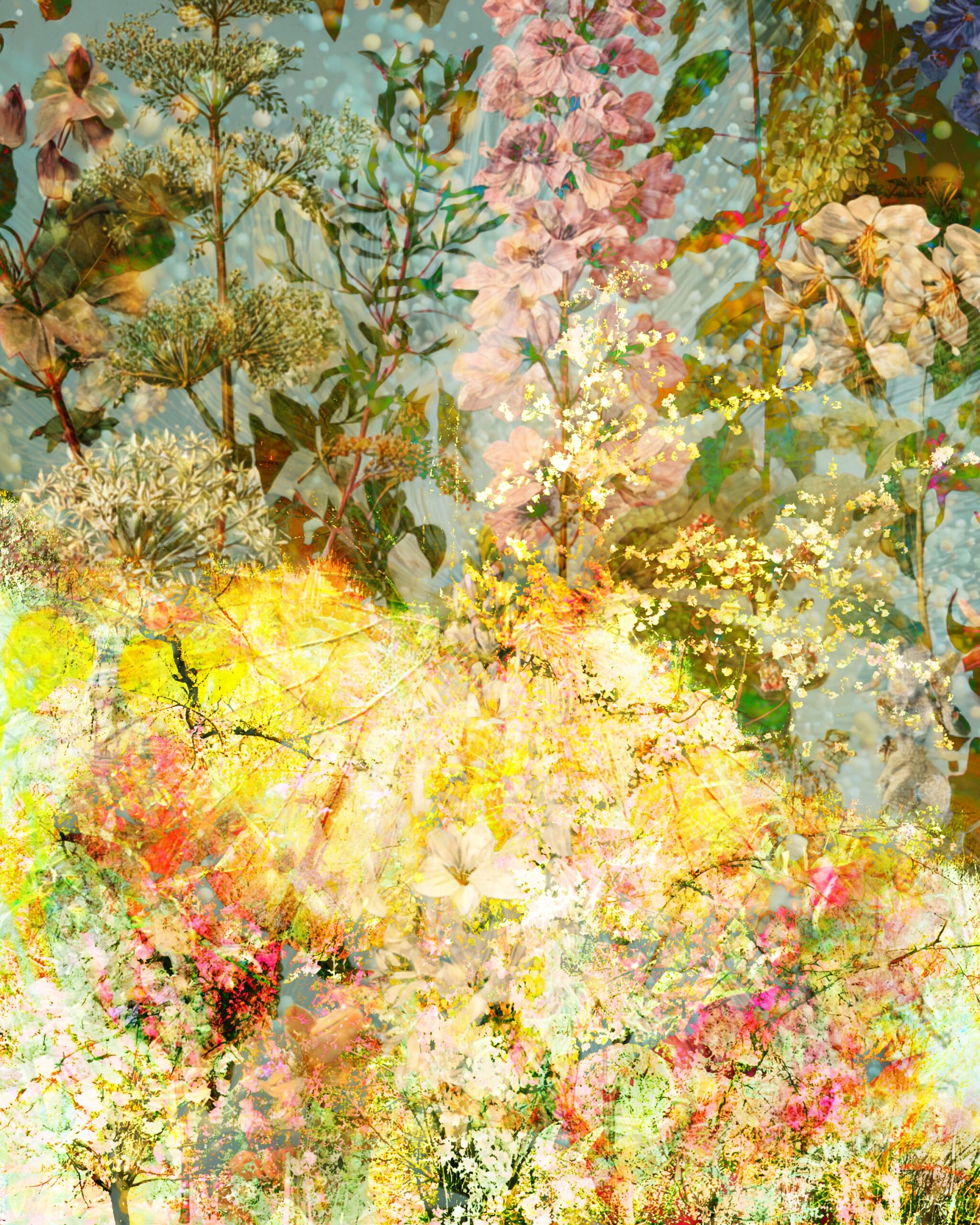
Mixed media backgrounds are often full of textures, layers, and unexpected materials; from torn papers to metallic foils, gesso washes, or vintage stamps. These can clash if not unified by thoughtful color choices.
Imagine working with both watercolor and collage. Without a harmonious color scheme, your background may overwhelm the focal point of your piece. But by choosing a cohesive palette; such as muted earth tones or complementary brights; you create an inviting visual flow that supports, rather than competes with, your foreground elements.
Tips for Creating Color Harmony in Mixed Media
At Cosmic Moon, we encourage intuitive creativity; but these techniques can help ensure your backgrounds are balanced and beautiful:
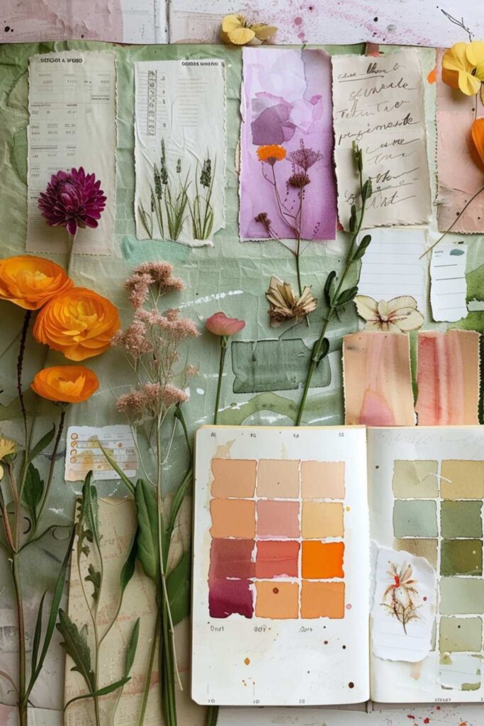
1. Start with a Color Story
Pick 2–3 core colors that reflect the energy or theme you want to convey (e.g., serenity, magic, chaos). Build from there with supporting tones; like neutrals or metallics.
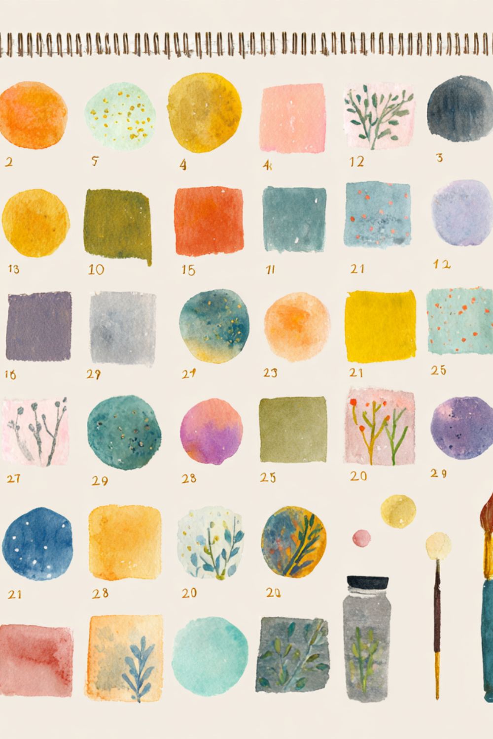
2. Use a Color Wheel
The color wheel is your best friend. Look for analogous colors (next to each other on the wheel) for a soft, cohesive look, or complementary colors (opposites) for contrast and drama.
3. Limit Bold Contrasts
In mixed media, contrast is exciting; but too much can overwhelm the senses. Use bold hues sparingly, perhaps in focal points or final details.
4. Balance Warm and Cool Tones
Mixing warm (reds, oranges, yellows) and cool (blues, greens, purples) colors can add depth; just make sure one side dominates to avoid muddiness.
5. Test Before You Commit
Do a quick swatch test on scrap paper. See how the materials interact; some paints bleed, some inks dull over texture. This helps prevent clashing tones.
Ready-Made Color Combinations for Mixed Media Backgrounds
Choosing the right color palette can transform your art journal pages and mixed media backgrounds from busy to beautifully balanced. If you’re looking for ready-made color inspiration, here are some harmonious combinations you can try:
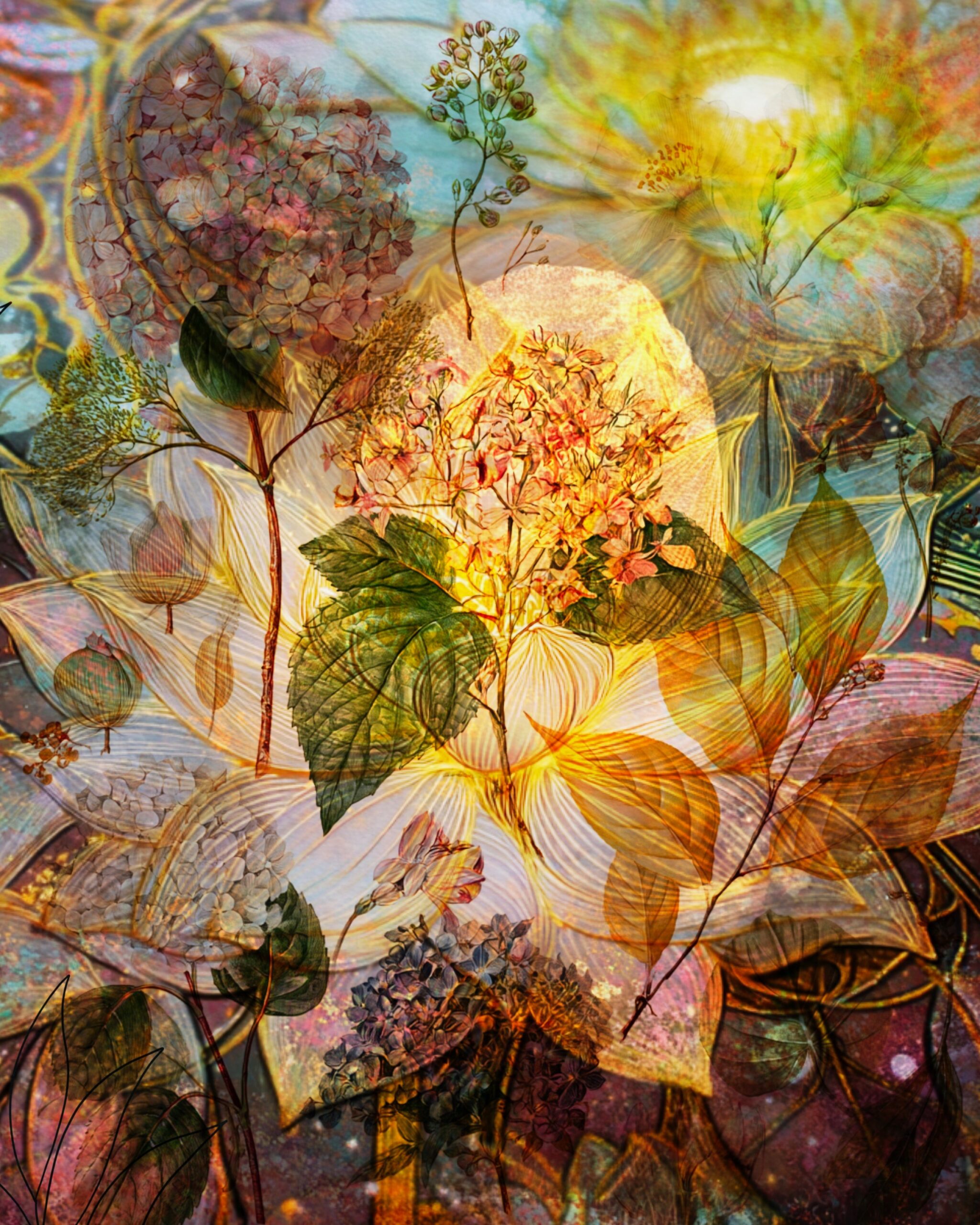
- Earthy & Calm – Burnt umber, raw sienna, olive green, and cream.
Perfect for vintage-inspired art journals or junk journal backgrounds. - Ocean Breeze – Turquoise, teal, soft sand beige, and warm coral.
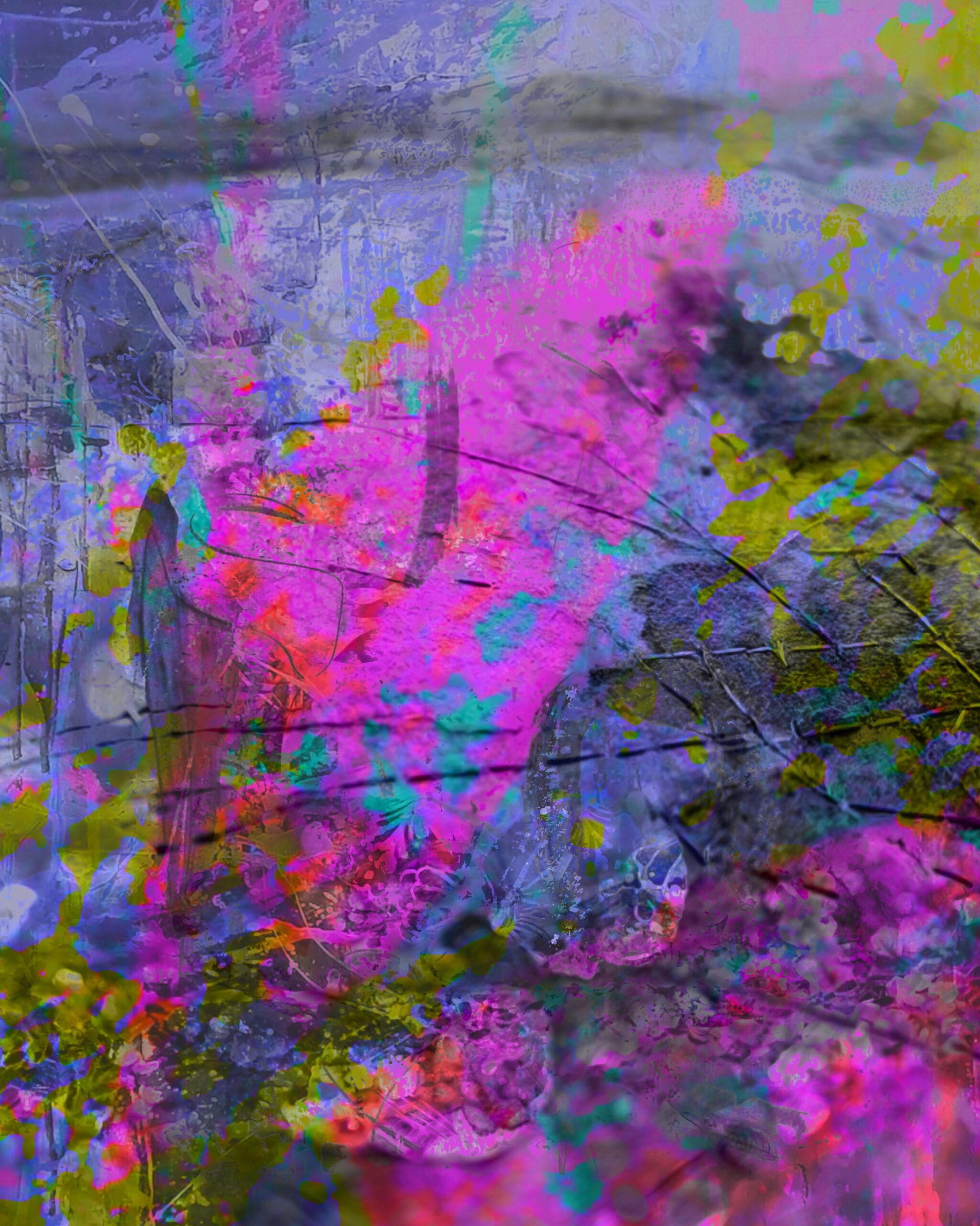
Great for coastal-themed collage papers and nature-inspired spreads. - Bold & Bright – Fuchsia, lemon yellow, cobalt blue, and black accents.
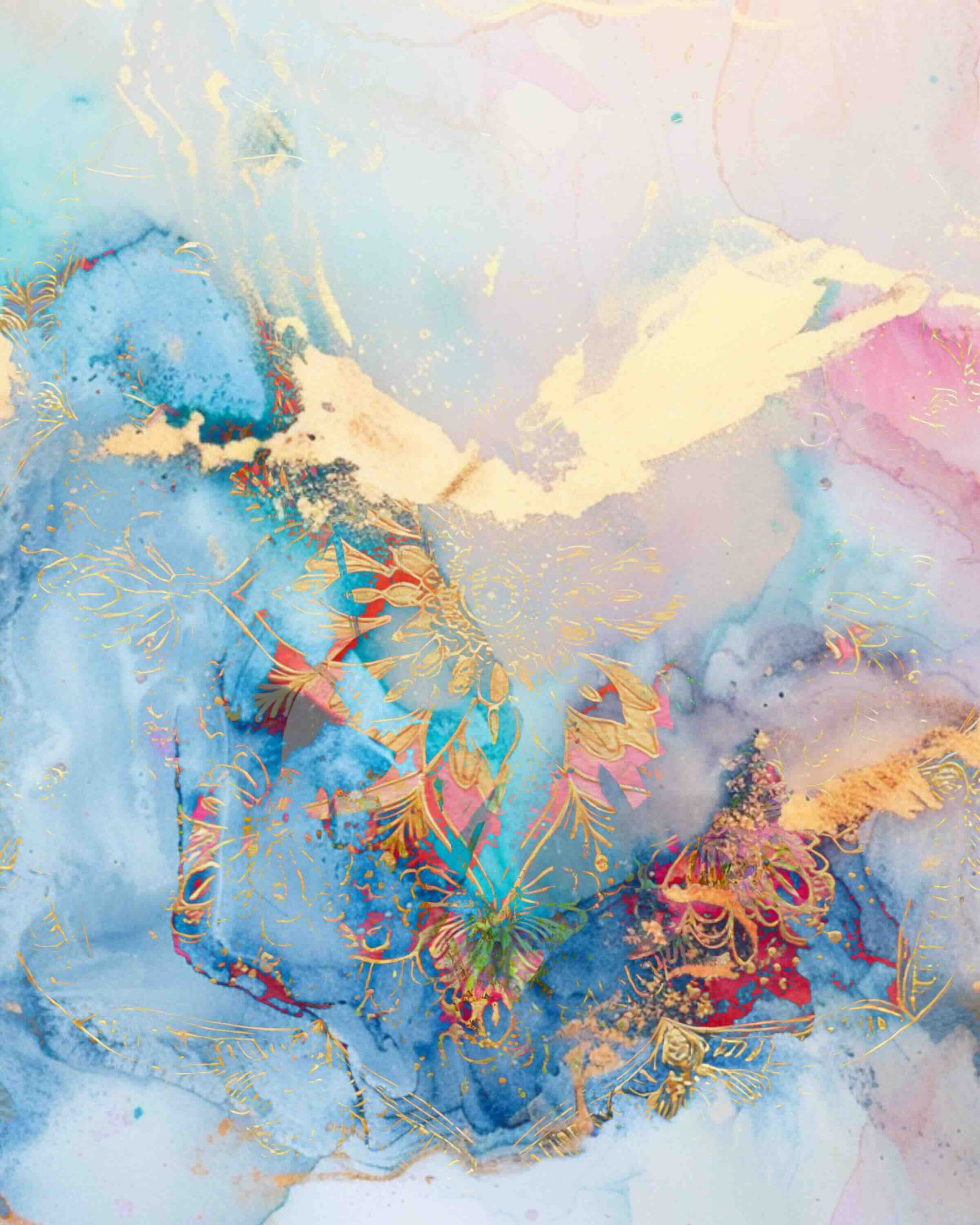
Works beautifully in abstract mixed media art for a striking contrast. - Soft & Dreamy – Lavender, blush pink, pale aqua, and white.
Ideal for ethereal backgrounds and whimsical journal pages. - Autumn Glow – Rust orange, mustard yellow, deep plum, and forest green.
Adds warmth and depth to layered mixed media projects.
These color palette ideas not only help with design decisions but also make your pages more cohesive. If you often get stuck choosing colors, start by picking one of these combinations and then adjust tones to suit your theme.
Color as the Bridge Between Chaos and Intention
Mixed media invites experimentation, but color is the quiet guide that brings your creative chaos into alignment. Whether you’re layering paints and papers in an art journal, building richly textured mixed media backgrounds, or crafting a one-of-a-kind collage project, harmonious color sets the tone; both visually and emotionally.
We celebrate intuitive art practices while honoring the power of mindful design. Harmonious color isn’t about perfection; it’s about intention. By exploring thoughtful color palettes and ready-made color combinations, you can bring depth, balance, and beauty to every page or canvas you create.
Download Your Free Mixed Media Color Guide
Discover the secrets to effortless color harmony in your art with our color mixing cheat sheet PDF. Whether you are an art journaler, painter, or designer, this guide will help you create with confidence and joy.
👉 Download your free guide today and start creating your most harmonious art ever!
✨ Enjoyed The Post? Here’s How You Can Support & Stay Inspired! ✨
If you love these resources, here are a few easy ways to keep the creativity flowing and help me continue making free designs for you:
💖 Buy Me a Coffee – Fuel my creative process by buying me a coffee! Every little bit helps me create more goodies for you.
📌 Pin & Share – Spread the word! Share this post on Pinterest or your favorite social platform so more makers can discover these free printables.
📚 Explore More Free Resources – I have a growing library of free downloads. Browse all the freebies here and grab anything that inspires you.
🔔 Subscribe & Visit Often – Sign up for my newsletter or check back regularly; I’m always adding fresh printables you won’t want to miss.
Your support means the world to me and keeps this creative community thriving. Thank you for being here!
🌟 With gratitude, thank you for supporting independent artists!
For Usage Terms: Clck Here